Wednesday, 17 March 2010

Audience Feedback

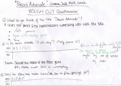
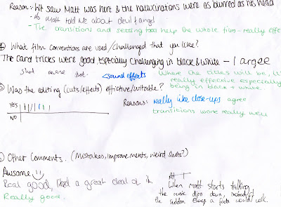
Feedback from Media Class, before final edits...


Feedback of Final PA from Younger Target audiences (16+)

"i loved it, you guys really pulled it off
i had to watch it again cause i thought wait that cant be luke
its like a little mini-movie in its self .... although you couldnt tell that he had a tumor seemed more like a headache
it was great :D
were you and jemma like the devil and angel one trying to get him to spend his money and the other telling him to save it ?"


"I thought it was very good. I loved the two Devil and Angel characters, and the way you can definately tell who they were from the costume and the...gestures, yeah the gestures they make. Oh, I didn't really understand the storyline though."


"yes sonia the baddy!!!
i love the whole story board -- but its probably the background scene (and maybe at the beginning, you would see the players already sitting down instead of them walking to their seat) -- when the guys head is hurting as well --- ask if he could do it a bit more naturally (sorry but looked kind of fake)
i love the angel and devil at the end
hope it helps :)"


"It was fabulous. I really liked the soundtrack and the like different camera angles and everything. It all looked really good. I liked all of the close ups of like you guys and the table and everything. It was all great."


"I really liked the video. I wish it could be created as a full length movie because the small clip was great. It did have a brilliant look and feel to it but I think that the blurry bit at the beginning when they all go to the table could have been improved. However I think without the effect the scene wouldn't have looked right. Also, I think the order of the angel and devil bit is wrong - the angel should have come on first so the guy could then see the devil and go with the devil. But overall the video was awesome."


From Older Target Audience (30+)


(From msn convo)

This was amazing!
Karl thought it was amazing I really liked it
The color and b/w contrasts are super, your script proves that you can really tell a story in 2 minutes
camera cool, set cool, clothes and make up coolio!

Here' the one comment from both of us
This refers to "Michael Caine on acting" - try find his video or look it up...
if you want to be great DON'T BLINK - especially in the close up
if you watch Meryl and the rest of them they hold still even 'till the tears come
it's far more powerful and commanding
again just a comment and observation!

"I" - Amateur Film Maker, Film Lover.
"Karl" - Camera Man, Film Lover.

Video Summary:
- Logical and realistic
- Actors need to be older - have more of a gambler look

Copy-righted Music Permission Application Email

Dear Sir/Madam

I am writing to ask for your permission to use your song “Warriors Dance” from your album “Invaders must die” for educational purposes. The song will, with your permission, be used as a soundtrack for our AS level Media studies film opening. Due to obvious copyright laws we will not distribute or sell your material in any way.

Matthew Laverack

We ask you to sign the below slip if you would like to give your permission:
Confirmed by:

LICENSOR (theprodigy)
_________________________
[Theprodigy]

Monday, 15 March 2010

Note...

Evaluation Question 5 is together with Evaluation Post 4

:)

7) Looking back at your preliminary task, what do you feel you have learnt in progression from it to the full product?

Compared to the preliminary task, PA was substantially more organised and each step was planned. A schedule was followed and at the start of every planning, filming, or editing session we as a group went through our tasks. Research and planning had to be thorough. I find that personally I wasn’t well organised enough when it came to props and costume. As I was working with the Extras the most I had to organise each character and make sure they had clothes that was remotely similar to what was drafted.

Though this time, filming was very different as we (me and Jemma) were not the main actors. Filming took longer as there were more people and the extras took time to prepare and organise. Setting up the three Redheads and camera was very time consuming and the filming location (Drama room 1) had to be booked. Most of the filming was done after school, meaning taking time out of our timetables and at time suitable for everyone.

Skills in Creative decisions during editing has improved a lot for me. Transitions and effects such as Peephole and changing the saturation of the picture is done with the question of how it represents the characters/target audience/ genre/conventions before it is done. This makes the final product more refined and professional in comparison to the prelim.

Teamwork this time was a challenge. As PA is a main part of the course, there were a few debates and creative decisions that clashed. These were worked out and compromised well but it showed me that teamwork also means putting your ideas down in place for others if they have a stronger view of what the film should be.

I would like to develop my editing skills more as I worked primarily in the filming side of Poker’s Advocate.

6) What have you learnt about technologies from the process of constructing this product?

Lighting
Working with Poker’s Advocate has taught me the importance of lighting and how different moods can be created from it. I know the health and safety issues of using the Redheads and Boom mic, as well as setting them up correctly and placing the correct equipment in each box and setting during packing up. For example, when filming with dialogue, to capture a clear crisp sound, the tip of the mic should be pointed towards the speaker. To create different tones of light and shadow, opening/closing the “barn doors” of the Redheads intensifies/spreads out the light.

For example, the lighting of the character Luke – an LED light was used to illuminate the side of face and the Aviators. The bandoliers on the backlight was kept open but dimmed down so that a faint halo like glow illuminated the outline of his head.


Camera
Whilst using professional equipment (supplied by Jemma’s dad) I learnt how to hold a large camera steady and all its setting; shutter speed, grains to make certain effect (ghosting).
> This was shot with a low shutter speed, creating an almost ghost trail effect with the camera. It can be used to represent passing time or an alternative to Slow motion effects.

iMovie (Editing)
Compared to the Preliminary task, my skills on iMovie have improved a lot. Importing is easy now and I am familiar with what the different effects and options do. However my skills of working with shuffling sound bars may need some work.

I can take screen shots and apply them not iMovie as well as placing effects on them. This, unfortunately, reshuffles the sound therefore you have to place them back – which can prove difficult. During the editing of PA, I found that some effects won’t go on unless the actual product is longer than 6 minutes. This is troublesome when a film opening is only 2 minutes long. Taking plain stills and placing them at the end of the timeline extends the length of the product, and by putting transitions then effectively tricks iMovie. These stills can be deleted at the end. I did this with the pre-title credits and the titles at the end.


For research and planning I found the following sites useful.
Movie directors and production companies: www.imdb.com
Movie soundtracks for reference: www.ez-tracks.com/Movie_Soundtrack.html
Film opening clips, in particular gambling ones: www.youtube.com
iMovie help: www.docs.apple.com www.apple.com

Clips from films such as ‘Lock. Stock and Two Smoking Barrels’ was really helpful when looking for gambling film conventions and camera shots/angles used in them. Also after researching different films, IMDB proved very useful for finding suitable production companies and directors who have a certain style when it came to Casino films, as the Casino life itself has created a genre of its own due to conventional styles in them.

4) Who would be the audience for you media product? AND 5) How did you attract/address the audience?

The specific target audience of PA would be people ranging from 16 to late 30s years old. The film’s genre includes gambling, illnesses, family issues, and perhaps some witty humour therefore it would not appeal to younger years. Older men in particular would be appealed because the character Dave may be relatable as he is imaged to be “the average bloke caught up in something extraordinary”. Teenagers may relate to the characters as people they want to be. Such as Holly, the rich girl who plays poker for the sake of it and does not care to lose – younger generations may find this character as an escape, therefore be attracted to the film.

In terms of creative choices, such as editing and soundtrack choices, the target audience was given great consideration. For example, children would not know Jimmy Hendrix or Black Sabbath. This music represents an older generation of target audience and in particular people who enjoy Rock music and movies with a lot of tension and action.
Cuts are quick and small gestures lasting for a few seconds are suitable for a more mature target audience as they can pick up on the implications of these details. Children would notice but may not consider how much an eye movement or tapping finger can mean. The pace of the movie may also be confusing for younger and less attentive years. Therefore PA caters for people who’ve watched many poker movies or has experience in it, and can keep up with the speed of events within a short amount of time.

On the other hand, those who have a vast amount of experience in poker might find this film irritating as creative and dramatic choices are taken in to make the game more interesting than it actually is. The opening features a short clip of the protagonist’s hallucinations. Those who play poker might find this unrealistic. Moreover, the experience poker player might notice that the cards on the table and in the hand have a flaw and cannot be used in the game. During filming, creative liberties were taken and although the game was thought out, it was not planned properly as it is just a film opening.


The titles of the card trick in black and white may also seem mediocre to a real dealer, but as we did not have a dealer this could not be changed. Looking at the wider aspects, however, the titles suit the target audience as it gives an adventurous mood and suits the tense/action parts of the film. The short snappy cuts suit the pace of the music well in that they are in relative synch and build up atmosphere before the actual plot begins.

>
This idea, inspired from Train Spotting and various spy movies appeals to the target audience. It reveals the cool rebellious side of the characters and film and makes it serious but fun. This attracts both the teenager and older audiences of PA.

For casting, it would be ideal to cast characters around the ages of 27 to late 40s. However this was difficult to time table and to find people willing to act for us. To show the involvement of gangsters and loan sharks in PA, the character Leo was made. His clothing and body language was meant to reveal his “Big-man” attitude, and for convenience we had quite a muscular extra to play the part. However, on film day this extra was not accessible so this character had to be cut out. This was not a huge problem, but it decreased our range of target audience and perhaps made the variety of characters less interesting. On the other hand, the specific target audience would not be affected as much without this character.

Plans on how to attract and edit for the target audience was followed and successfully fulfilled overall. With the exception of certain shots due to bad camera work and extra transitions such as the peep hole. These were added during the process of post production but the end result still suited and improved the film for the target market.

In conclusion, the target audience for Poker’s Advocate are teenagers who enjoy the idea of a secret and wild life, as well as a more mature audience who have experience in gambling and can relate to the older characters within the film.

3) What kind of Media institution might distribute your media product and why?

Poker’s Advocate would be distributed within the USA by Universal Studios and possibly by Summit Entertainment Internationally. Both these companies have distributed ‘Lock. Stock and Two Smoking Barrels’ and ‘Fear and Loathing in Las Vegas.’ Columbia Pictures would also be a good choice, as it has distributed ‘21’ which deals with Poker but its genre is very different to PA so it would be less suitable compared to Universal Studios.

However, if Poker’s Advocate would take the more artistic route and wish to be separate from large production companies, it could be invested using independent production companies, especially those in the “Poverty Row” (a catch all term used to encompass any other smaller studio that managed to fight their way up into the increasingly exclusive movie business). Republic Pictures is an independent film company that operated through 1939 to 1959. It specializes in western films and movie serials, and likewise PA could find a independent production company that would produce and distribute Poker/casino related films, that could appear as TV specials.

2) How does your media product represent particular social groups?

The social groups represented in Poker’s Advocate include Gamblers (in particular underground) and Rich people. Gender and Class/Status is also represented.

Gamblers are represented in different ways. As our film does not centre on posh Casino gambling, there are no men in suits or tuxedos. Each character has its own personality and background reflected in their clothing and positioning.


The way each player walks into set at different times but arrive at the table at the same time shows that they a essentially different, but once they are gambling they are all the same. This represents underground gamblers are very different to those in Casino Royale type of play grounds – class and status does not matter to these people.


(Refer to Gary - Left, and Dave - Right) This Establishing shot appears after Holly and Luke fold - making it clear who is left in the game.


There is always an experienced gambler. In Poker’s Advocate this is Gary. His leather jacket reflects his smooth and almost criminal personality and the cowboy hat shows his slight sense of humour.

The protagonist does not dress classy or fashionably and even his casual is below average casual. He wears an olive-green-brown coloured fleece jacket, t-shirt, and short cropped hair. (I would have liked Dave to have a beard or stubble to give him a rougher look, and to represent age but this wasn’t realistic in our time scale) This represents the downtrodden and almost weak gamblers in the society portrayed in this film. Dave is part of the group of people who don’t gamble for fun or leisure, but for the cold, hard, cash. Be it to fuel their drug or drinking habits, or to pay a debt. It could be argued that he is the stereotypical underground gambler. The audience is expected to either pity this character or be in awe at his stupidity.


Rich people are presented differently in PA. It would be assumed that they don’t take part in underground gambling, but the character Holly is rich. This is shown through her dress, glittery scarf, combed hair, and pearl necklace. She is a neutral character, and does not seem to have a large part in the film. However her high class status implies that even those higher up are not clean. They are aware and involved in what goes beneath their society and might even control it with the correct power.

The representation of age is a problem as our actors/extras were not the actual age they were meant to be in the script. The age range of PA is late 20s to late 40s. This was something that could not be changed unless we got older actors.
All of the characters are Caucasian. This was unintended and if made into a real film PA might have different ethnicities to expand on the representation of underground gamblers.

Overall the main social group is underground gamblers and the diversity within them. The representation of them could be argued as both negative and positive, as it shows the darker and unbeneficial side to gambling but also creates a sense of freedom and edgy lifestyle.

1) In what ways does your media product use, develop or challenge forms and conventions of real media products?

‘Poker’s Advocate’ (PA) conforms to the conventions of a pre-title sequence where in the credits come in after 2 minutes of film rather than at the start. The beginning two minutes usually shows the audience a scene from the half way point of the film. To refrain this pre-title sequence becoming trailer like, use of fades in between cuts were not used often, and only for the Angel and Devil scene to show distortion.

Quick cuts are used here to build up tension. There is little dialogue so the audience would be less informed at the start of the film. If crucial lines that reveal the plot twists are revealed, it would make the opening too much like a trailer. Plot details are unimportant in film openings.


Fade is used here as it conforms to the transition techniques used to represent a flashback or memory used in films. Here, it represents the unstable mind of the protagonist and hints that the Angel and Devil are merely hallucinations.

Pre-title sequences still show the production logos before the film begins, and PA does that. The idea of ripping a production logo (e.g. Universal or Paramount) was proposed, however that would take time and copyright issues may arise. Making our own logos would show creativity and show how conventions are followed in our original production logo. Three logos were drafted and rather than choosing between them, all were refined and put in. This continues to follow conventions as associate or supporting companies are usually involved therefore films can have more than one production logo.


Conforming to Production Logos in general, Bullseye Productions gives an image and animation for the audience to focus on.


The first image settles, and a second which is more important appears. This is an opportunity for sound effects or sound bridges. In Poker’s Advocate the effect from iMovie called [insert here] suits the swish movement of the letters; another convention that occurs in Production logos.


After all the effects and animation, there is a pause that allows the audience to ‘absorb’ and take in the logo. This in film time is only a few seconds so that it does not drag and become boring. These are all conventions followed.


Shot reverse shots and close ups follow conventions in that they shows a character’s reaction to dialogue. The shot reverse shot is taken from over the shoulder at times, and close ups take in details such as chair shuffling and important eye movements.


Holly’s gesture of tucking hair behind her ear can show nervousness of her character, a contrast to the confident concept of her character. It gives realism to her, as it is a very normal gesture that girls do.


This CU shows Luke glancing at his cards. This creates mystery and tension, as well as showing the audience that this is a real and serious poker game.

Other Conventional camera angles include:


Establishing shots: This sets the scene. Here, by the props and lighting the audience can tell it is a mysterious, and possibly dangerous area, and the main entertainment/focus is poker.


Extreme CUs: This shows the character's key expressions. Here Dave gives a strong look to Gary, showing thought.


Tracking shots: Can act as a POV shot as well as following movement and giving a variety to camera angles. Here the camera follows the Devil's hand, putting importance in her movement and showing the character's control over Dave.


Monday, 1 March 2010

Sunday, 28 February 2010

Film Production Log

(Click to enlarge)


Amended Schedule

Due to prior engagements etc the schedule was changed. This is the one that was actually followed. (Click to enlarge)

Potential Poker’s Advocate soundtracks – chosen by Jack

In class we have listened to each of song and gave comments. At this point it is still unclear which one to use as we have not placed all the wanted clips onto the timeline yet.

Theme from Sin City
Cat People
After dark
Nothing else matters
Planet Caravan
If 6 was 9
Voodoo child
Sympathy for the Devil
Sun King
Blew
Love buzz
Dive
Hairspray Queen
Big Long Now
The Little things
Fraternity Suite
The scheme
Revenge
Fox's decision
Blind
Wraith Marsh
Warrior's Dance

Saturday, 27 February 2010

Making of Production Logos

I searched the Internet for a free flash animation software, and found Swish Max3. Using the trial period I created 2 Production logos for Poker's Advocate. Sound effects will be added on once imported (or soundbridge with main music).
(As it was a trial period, not many screen shots were taken)

Bullseye Productions

Draft 1

Name: "Bullseye Productions" was inspired from the feelings of wanting the film opening to be spot-on/perfect, and that it matched the image found beforehand. It didn't matter what the production studio was called or for what purpose as in reality, production logos did not necessarily have to match the film.
Image: (Taken from Google)


The idea of a dartboard came to mind as I was thinking of "Stereotypical Men's Games" as the film was about Poker and gambling. The image has a bold colour scheme of Black, White, Green and Red. This would give a wide selection of shades for font colour. There were also loads of animation ideas to put onto the dartboard to suit it. Such as the "twirl in from left" or "bullet" animation. As the image is round, it looks more professional and neat.


Font: "BIONDI"


This reminded me of the font used outside a Salon in cowboy movies and somehow it seemed to fit the dartboard image. Coloured and sized on WordArt from Microsoft Word, it was made a image on Paint then put into Swish Max3. The first and last letters were put in capitals so that it frames the logo and stays symmetrical.

Animation: Choosing text animation templates for this logo didn't take long - not many chosen fit well and I had to be cautious it wouldn't look tacky or over-done. The template "Swirl in" was chosen. I played around with the degrees of it and made the letters swirl in from the right side, as if sticking onto the dartboard. Once the text was animated, it left a print on the BIONDI font - giving the effect of paint dripping. This was not intended but as it did not look too different I decided to leave it.
The problem with this first draft logo is that it only takes up 5 seconds. The speed was decreased later on to allow a sufficient amount of time for sound effects.

The image below is a screen shot of the first draft logo being published. If I could do this project again I would take screen shots at each edit I make, and before the trial period ends.


Draft 2

Not much was changed on this version in terms of animation, size, text. The speed of the animation was decreased.

Final Logo

After getting feedback, I found out that more animation could be put on to the logo to make it more interesting. I did some quick research on other Production Logos and found there was usually more than one animation/movement.

The dartboard was given the same animation template as the text but slowed down. I made sure it got to the background quicker than the text and had a longer pause. This is so that the audience has something to focus on before the text arrives. It was also lengthened so that the audience could really take in the production logo and give time for the fade effects that would be added on whilst editing the opening.


Spark Studios

Draft 1


Name: The name "Spark" came from the font of Bullseye Productions. The BIONDI font reminded me of cowboys, which lead to guns, which lead to gun powder and sparks. Matched with "Studios" it flowed and had a snappy ring to it.


Image: (Taken from google)


The above is an GIF animation of a single firework. The theme to start a Production studio logo was "Celebration" and as it happened to be close to Chinese New Year, the idea of fireworks came to mind. It also suited one of the production studio name ideas that was noted down. The problem with this animation is that it repeats itself and only lasts 1.5 seconds roughly. It had to be slowed down or cut off near the end to leave a black background. The GIF Image was copy and pasted several time and made into different sizes. Placed across the screen, each one was timed so that it would start at different intervals, but finish, fade out and pause long enough for the font to appear with a plain black background.

Font:


BIONDI, WordArt, and Paint was also used here. However I decided it looked too pixelated and unprofessional. Once animated tit looked even more pixelated and tacky.


Instead, I used the text box and templates on the software Swish Max3. It was clearer and templates/layers could be put over it as well as multiple animations. The text is CASTELLAR. I chose this as it was simple yet had its subtle flicks off each letter giving it style. The word "studios" was smaller and placed underneath "Spark" as it was of less importance and gave the logo a boxed shape - different to Bullseye Productions where the text was on one straight line.

Animation: Not much animation was done here. There was a simple fade in and out on the still shot of the GIF image and text. The text appeared first, allowing a 2 second gap before the still image faded in. A pause was made at the end of the animation to allow the audience time to take in the logo and read it.

Draft 2

One of the comments from the feedback was that the orange text on the orange still shot of the firework made it harder to read, and more emphasis should be put on the work "Spark". Therefore, I added in another template over the text, making white fade over the orange text. It becomes more defined and noticeable.

Final Logo

Another comment was to add more animations so there was "more to see". Therefore the template layers of the orange and white "Spark Studios" text was switched over. This made the white text appear before the orange. The orange text was animated with the template movement "Explode from centre". The fade in of the still shot firework was delayed but the fade was sped up.

After importing onto the iMovie project of Poker's Advocate, this production logo may need to be cut shorter to delete the first GIF 'explosions', if necessary.
B Productions
This logo's original idea and animation was made by Jemma. However due to technical difficulties, the main images and text was sent to me to put onto Swish Max3.
I found that this software wrecked the original logo. It seemed the main image was photoshopped before - by whoever the image actually belonged to - therefore leaving pixel-ish marks. The animation left marks as well; at the start of the logo, a faint outline of the letter B can be seen. Due to time limitations this could not be changed.
Notes
For some reason my computer only allowed the logos on Swish Max3 to be saved as GIF files. (There were other options, such as AVI files) So, once imported on the Mac computers at school, they had to be converted seperately into MPEG4 files - other wise they would not play on iMovie.

Rough Schedule

(Click to enlarge)


Thursday, 25 February 2010

Lighting Crash Course

As I was not present for the lighting master class that Jam and Jack went to, I was given a brief lesson on lighting before shooting.


Note: Boom mic – head of mic should follow the speaker. Point the tip towards the actor speaking and slowly move to the other to receive better quality sound.

Health and Safety
  • Do not change lights with bare hands – oil on hands will burst into flames as Redheads are made of halogen light bulbs.
  • After using Redheads, wait for Bandoliers (the “barn doors”) to cool down before closing.
    Make sure no one is looking at the direction of the light when turning on Redheads.
  • Do not plug lots of Redheads into one socket – may blow the fuse.

Lighting

  1. Back light – Gives a nice glow, and can define subject/objects in shot with a white line. Adds depth to shots.
  2. Key light - Generally faces main subject, lined diagonally to the subject, which at that angle defines the shapes of the subject and adds more depth.
  3. Fill light – Illuminates the rest of the set, and can act as a side light.
  4. Working with shadows – Don’t overexpose areas with lighting. Create shadows in the right areas (or how you perceive them/want them to be) using an LED “twinkle” light.
  5. Change angle (or close) the “Barn doors” Bandoliers of the Redheads. This decreases the intensity of the light and gives shape.

Wednesday, 20 January 2010

Final Planning Vlog

Props and Costume

Where to get the costumes?

  • Charity shops
  • Borrow from extra's cast
  • Cheap clothes stores

Dave, Gary, and Extras.


The "Angel"


The "Devil"


Props


In the case a poker table cannot be found, a green velvet or felt cloth could be put over a round table instead.


Eyeliner pencil for body art. This is to create the swirling patterns that run up the Angel and Devil's arms.


Small stickers to define detail on the body art. Easy to peel off and will look good on CU shots. Light colours for Angel, black and sharper flowers for Devil.


Sunday, 17 January 2010

Possible Locations

The first choice location for 'Poker's Advocate' is Drama room 1. It has lighting equipment that will give the frames clear visuals. The black floor and curtains gives a dynamic background and pulls focus to the actors and poker game rather than the set. This mise-en-scene will allow the atmosphere of the film be made mainly by sound and music.


The following are possible locations in the case that the drama room is unavailable. We could use these small rooms for close up shots as you don't see the background. If we don't have the drama room for mid-shots, display boards could be borrowed and we would drape black cloth over them to mimic the drama room.


This small room is useful for filming CU and ECU shots as less of the set is seen. The enclosed space with the setting boards will create a feeling of claustrophobia that could mimic the panic in the character Dave.


Setting boards could create a corridor and with lighting equipment, it could mimic the entrance to an underground poker room. The lighting would be used to produce the feeling of obscurity.


The round tables in the sixth form common room are ideal for the poker table as a real one is not accessible.


The protagonist Dave could enter the game room via lift, with a CU of his eyes watching the numbers on the lift decrease as he gets to the game room. However this shot would distract the audience from the main point of the film which is the poker game.


From the top library, this would be a good shot for a birds eye view of the players entering the poker game room.